兛
Character Story & Explanation
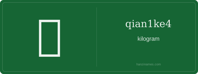
兛 is rarely spoken aloud and almost never used in formal writing today; it appears mainly on physical labels, handwritten notes, and older printed materials—especially in markets, pharmacies, and factory packaging where space is limited. It was officially endorsed in the 1955 'List of First Batch of Simplified Characters' as a 'metric abbreviation', though later de-emphasized in favor of 千克 in education and digital media. You’ll find it on vintage tea tins, herbal medicine bags, and municipal market scales across southern China and Taiwan.
The character has no pictographic origin—it is a modern ligature, not an ancient ideograph. Its form merges simplified 千 (as 八-like top) with full 克. Since no oracle bone or seal script precursor exists, its 'origin story' is bureaucratic: born in 1930s standardization committees seeking compact metric notation for mass literacy and industrial labeling.
As an archaeologist sifting through layers of modern Chinese orthography, I unearth 兛 not in bamboo slips or bronze inscriptions—but in mid-20th-century metrology documents and handwritten market ledgers. This character bears no ancient pedigree; it is a deliberate, pragmatic artifact of linguistic engineering—forged in the 1930s–50s to compress the two-character unit 千克 (qiānkè, 'kilogram') into a single, space-saving glyph for labels, scales, and official forms.
Its form is a hybrid palimpsest: the left side 八 (bā) is a stylized simplification of 千 (qiān, 'thousand'), while the right side 克 (kè) remains intact—retaining both phonetic and semantic fidelity. No oracle bones whisper its origin; instead, archives reveal its adoption by China’s Standardization Administration and the Ministry of Education as part of post-1949 metrication efforts, prioritizing legibility and efficiency over etymological purity.
Though absent from classical texts and excluded from the Kangxi Dictionary, 兛 thrives in functional contexts—grocery receipts, pharmaceutical packaging, and textile weight tags—where brevity trumps tradition. Its ‘zero strokes’ annotation reflects a typographic reality: it is not drawn stroke-by-stroke like standard characters but composed digitally or typeset as a ligature. This makes it less a glyph than a *glyphic convention*—a fossilized abbreviation, preserved not by ritual, but by utility.
Example Sentences
Common Compounds
Similar Characters — Don't Mix These Up
Your First Step into Chinese Culture: Get a Chinese Name
Every journey into Chinese begins with a name. Use our free Chinese name generator to create a meaningful, personalized Chinese name that fits you perfectly.
Get My Chinese Name →